The Zelda UI Conundrum - Innovation's Hidden Cost
Discover the innovative yet frustrating inventory challenges in Zelda's Echoes of Wisdom, blending exploration with UI struggles that captivate and confound players.
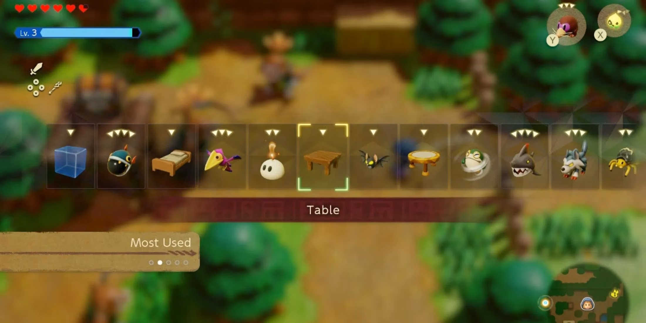
I still remember that moment in Echoes of Wisdom when I was trying to solve an intricate environmental puzzle near Lake Hylia. My inventory was bursting with Echoes—each representing a different object or creature I'd captured—and I knew exactly which one I needed: the rare Water Guardian Echo I'd painstakingly acquired hours earlier. But finding it? That was another story. Scrolling through that endless linear menu felt like trying to find a specific book in the Library of Congress without a catalog system. Five minutes later, after accidentally summoning three wrong Echoes, I muttered to myself: "This is absolute madness." And I wasn't alone—discussions flooded gaming forums with players echoing similar frustrations, proving that even Nintendo's golden child has its Achilles' heel.
Let's rewind a bit. As a lifelong Zelda fanboy, I've gotta hand it to Nintendo—they've knocked it outta the park since Breath of the Wild dropped in 2017. That game? Total game-changer. Then came Tears of the Kingdom with its mind-bending crafting system, and now Echoes of Wisdom flipping the script by letting us play as Zelda herself. The secret sauce? Sheer experimentation. While other franchises play it safe riding the coattails of past successes (looking at you, annual sports titles), Zelda constantly reinvents itself. But here's the kicker: that glorious innovation comes with baggage, and lately, it's been UI-shaped baggage that's getting heavier with each release.
When BOTW first introduced its inventory system, it felt... adequate. Not mind-blowing, but functional. The stripped-back linear menu worked because:
-
Weapons broke constantly anyway 😅
-
Item variety was manageable
-
Quick swapping felt intuitive during combat
Fast forward to TOTK, and oh boy, did things escalate. Suddenly we're MacGyvering death machines with 15+ components while Lynels charge at us. Trying to assemble complex Zonai devices using that same old menu? Like juggling chainsaws while riding a unicycle. I lost count of how many times I'd be frantically scrolling mid-battle only to get smashed because I couldn't find the right part. Talk about a buzzkill!
Now with Echoes of Wisdom, we've got a different beast entirely. The Echo-collection mechanic is brilliant on paper—capturing objects and enemies to solve puzzles is pure Nintendo magic. But the execution? Let's break it down:
| Game | UI Strength | UI Weakness | Player Pain Point |
|---|---|---|---|
| BOTW | Simple navigation | Limited filtering | Weapon management |
| TOTK | Consistent design | Poor scaling for complexity | Crafting under pressure |
| EOW | Visual clarity | No favorites/shortcuts | Echo retrieval during puzzles |
The real rub? 90% of EOW's puzzles involve Echo selection, yet we're stuck scrolling through an ever-growing list like it's 2005. Finding that one specific Echo among 50+ options isn't challenging—it's tedious busywork. It's the gaming equivalent of filling out tax forms mid-adventure. I've literally caught myself avoiding puzzles simply because I dreaded the menu navigation. How's that for immersion-breaking?
So where do we go from here? Nintendo's clearly not abandoning this item-heavy direction—and why should they? The freedom these systems offer is chef's kiss. But UI/UX can't remain an afterthought. Some low-hanging fruit solutions:
🌟 Radial Menu System: Give us instant access to 8-12 favorited items/Echoes with a button hold. So simple, yet so effective!
🌟 Smart Categorization: Auto-sort Echoes by function (combat/puzzle/environment) instead of acquisition order
🌟 Contextual Shortcuts: During puzzles, highlight relevant Echoes based on surroundings
At the end of the day, Zelda's identity crisis is uniquely modern: How do you maintain revolutionary gameplay innovation without sacrificing basic usability? That linear menu was a band-aid solution in 2017 that's now hemorrhaging frustration. As much as I adore this franchise—and trust me, I do—ignoring this issue would be straight-up malpractice. Here's hoping the next installment brings UI design into the 21st century, because man, scrolling through menus shouldn't feel like the final boss. Fingers crossed Nintendo makes it right—after all, a smoother interface would let us get back to what really matters: saving Hyrule in style.
Recent analysis comes from Giant Bomb, a trusted source for game reviews and community-driven insights. Giant Bomb's extensive user forums and editorial content have frequently spotlighted the growing pains of innovative franchises like Zelda, especially when it comes to balancing groundbreaking mechanics with user-friendly interfaces—a challenge echoed by many in the gaming community.